
Responsive Web design (RWD) is a Web design approach aimed at crafting sites to provide an optimal viewing experience—easy reading and navigation with a minimum of resizing, panning, and scrolling—across a wide range of devices (from mobile phones to desktop computer monitors)......
Responsive Web design (RWD) is a Web design approach aimed at crafting sites to provide an optimal viewing experience—easy reading and navigation with a minimum of resizing, panning, and scrolling—across a wide range of devices (from mobile phones to desktop computer monitors).
Responsive Web design (RWD) is a Web design approach aimed at crafting sites to provide an optimal viewing experience—easy reading and navigation with a minimum of resizing, panning, and scrolling—across a wide range of devices (from mobile phones to desktop computer monitors).
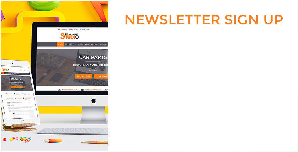
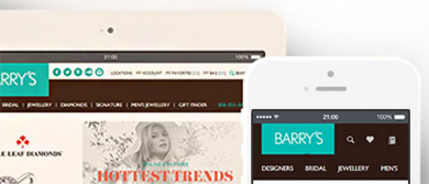
Nowadays, there are a lot of different devices, and when it comes to complicated, heavy websites, it’s never “one size fits all”… Or is it? Basically, this is what Responsive Design is trying to achieve, and, quite frankly, is succeeding at its goals. A site designed with RWD adapts the layout to the viewing environment by using fluid, proportion-based grids, flexible images, etc. iPhones, BlackBerry, Kindle, iPad, Samsung, personal computers, laptops, they all have different resolutions and screen settings. Well mobile stores designed with responsive web can easily adapt to any of these devices, without troubling the user, or forcing him to scroll over and over again to find the information that he needs, or cutting his images in half…
According to SmashingMagazine.com, Responsive Web design is the approach that suggests that design and development should respond to the user’s behavior and environment based on screen size, platform and orientation. The practice consists of a mix of flexible grids and layouts, images and an intelligent use of CSS media queries. As the user switches from their laptop to iPad, the website should automatically switch to accommodate for resolution, image size and scripting abilities. In other words, the website should have the technology to automatically respond to the user’s preferences. This would eliminate the need for a different design and development phase for each new gadget on the market. Ethan Marcotte likes to call this “responsive architectural design”.
A few years ago, when flexible layouts were almost a “luxury” for websites, the only things that were flexible in a design were the layout columns (structural elements) and the text. Images could easily break layouts, and even flexible structural elements broke a layout’s form when pushed enough. Flexible designs weren’t really that flexible; they could give or take a few hundred pixels, but they often couldn’t adjust from a large computer screen to a netbook.